
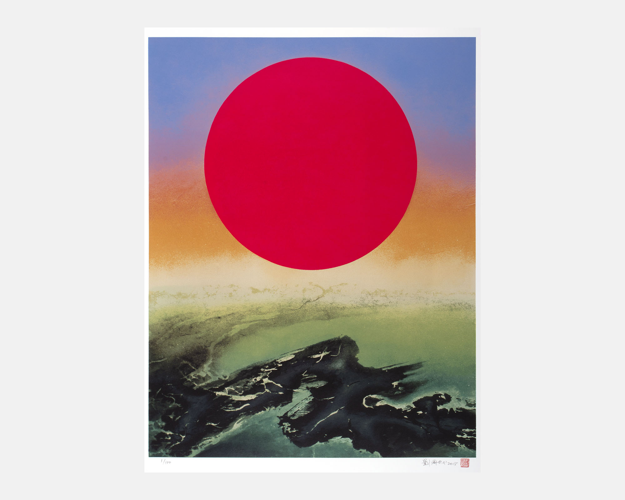
The distribution of colors in the original painting has a rainbow-like effect. Not only are the colors diverse, but the gradients are also complex; all of this increases the difficulties of printmaking. In order to reproduce the natural gradient of colors, during the division of colors between individual screens, the corresponding colors of the screens before and after must be taken into account. This ensures the proper layering of colors during printing.
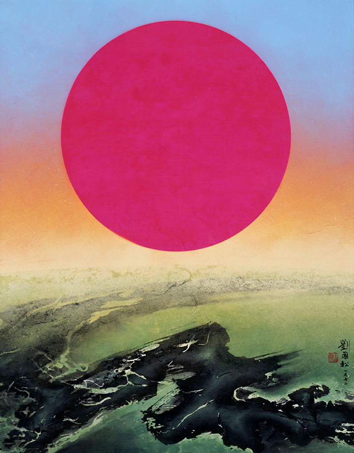
As of the sun in the original painting, acrylic neon paint was used. To achieve the same effect as the original, the studio experimented with various types of printmaking ink and in the end settled on formulating its own. Adding acrylic ink to the conventional oil-based printmaking ink creates a faint neon effect when printed and dried. This product of trial and error reflects the ingenuity of the printmakers, as well as their dedication to representing the original artwork.
Artist: Liu Kuo-sung (Liu Guosong)
Based on Purple Sun, 1970
Medium: Silkscreen Print on Paper (27 Screens, 27 Colors, 27 Runs)
Image: 90 x 70 cm (35 1/2 x 27 1/2 in.)
Paper: Arches, 100% Cotton, 300 g/m2
Date: 2015
Editions of 100, AP10
Signed, numbered, dated, and stamped with a seal by the Artist
Literature: The Scripture of a Missionary of Modern Ink Painting II, Lofty Art & Culture, 2015
Frame: Sold separately
Out of Stock
Based On
Catalog Entry
The Scripture of a Missionary of Modern Ink Painting II
Liu Kuo-sung once said “although my composition is essentially a circle and an arc, the colors, technique, and texture are greatly different.” Purple Sun is a prime example of a painting from the Space Series, composed of an upper circle and lower arc, in which the colors, technique, and texture are remarkable and visually stunning.
Liu Kuo-sung, Purple Sun, 1970 © The Liu Kuo-sung Archives
Related Prints

Etching Print on Paper
Out of Stock

Woodblock Print on Paper
Out of Stock

Etching Print on Paper
Out of Stock